IN THIS LESSON
Telling Visual Stories with Data
Anyone can throw data into a graph. But making a chart that actually helps people understand something important? That takes thought, strategy, and empathy.
When you visualize data, you’re not just putting numbers in boxes - you’re making choices:
What do you want people to notice first?
What should they feel, question, or even challenge?
What would make them stop scrolling?
Every chart is a kind of argument.

Different charts tell different kinds of stories — and some stories can only be told the right way if you pick the right form.


Choose the Right Graph …
“How much time do teens spend on different activities in a typical day?”
A bar graph compares categories: TikTok, school, sleep, gaming, etc. Who wins in the time race?
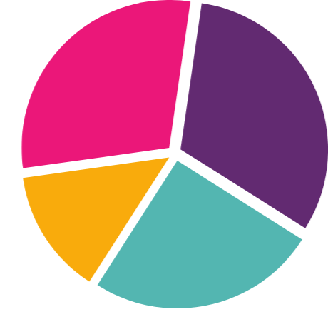
A pie chart shows proportion. What slice of your day does school take vs. leisure?
A stacked bar chart could compare how different students spend their 24 hours. Whose days are more balanced?
Here’s a thought: if you used a pie chart for everything, what kinds of patterns would stay hidden?
-
Compares categories
“How many students at your school prefer TikTok vs. YouTube?”
-
Shows trends over time
“How does screen time change across a school week?”
-
Shows parts of a whole
“What percentage of your day is spent on sleep, school, and scrolling?”
-
Explores relationships between two variables
“Is there a link between hours of sleep and mood?”
-
Shows frequency distributions
“How many students spend 0-1, 2-3, or 4+ hours on homework?”
The chart you choose should match the kind of question you’re asking.
Warning: Pie charts get messy fast. Avoid them if you have too many slices!
Labelling Axes and Titles
A chart without labels is like a song with no lyrics — people won’t know what they’re looking at.
Good charts include:
A clear, specific title (what’s this chart about?)
Labels for both axes (what’s being measured?)
Units (hours, %, number of people, etc.)
A legend, if there’s more than one dataset or color used

Watch:
Data Visualization & Misrepresentation
-
Add a short summary or a list of helpful resources here.